

IBERSYA brand identity
Official logos, colours, typography and identity manual, ready to download and use properly.
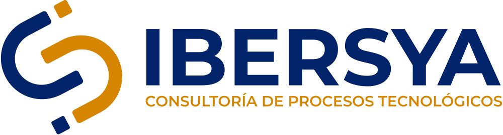
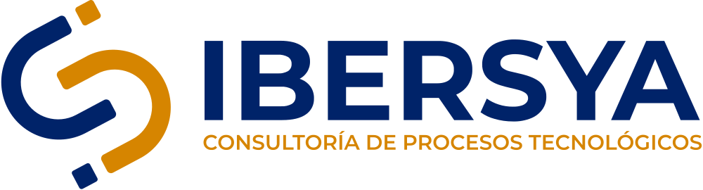
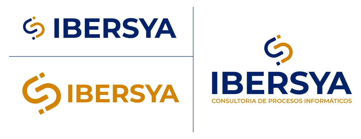
The identity of IBERSYA Consultoría S.L. is built on a curved symbol that combines corporate blue #002369, conveying security and solidity, with orange #d68500, bringing energy and proactivity, alongside the name in capitals and the descriptor “Consultoría de procesos tecnológicos”. The corporate typeface is Montserrat. On this page you will find the official logos in SVG and transparent PNG —horizontal, vertical and symbol, in colour, black and white—, the colours with their HEX, RGB and CMYK values, and the full identity manual as a PDF.
Logos
SVG for web, presentations and print; high-resolution transparent PNG for everything else.
Horizontal
Vertical

Symbol






Colours
Blue and orange are the primary colours; grey and light blue support them. Click a colour to copy its HEX code.
Typography
Montserrat is the IBERSYA typeface across every medium, digital and print, for its modern, geometric and highly legible character. It is free and available on Google Fonts.
Montserrat on Google Fonts →How to use the logo
The basic rules from the manual, so the brand looks the same everywhere.
✓ Do
- Always use the original files from this page, without redrawing or retouching the logo.
- On light backgrounds use the colour version; on dark backgrounds or photos, the white one.
- If you can only print in one colour, use the black or the white version.
- Leave clear space around the logo and always scale it proportionally.
✕ Don’t
- Change the colours or reproduce the whole logo in orange or any other colour.
- Alter the proportion between symbol and name, or stretch and distort the logo.
- Replace the descriptor “Consultoría de procesos tecnológicos” with other text.
Corporate identity manual
The full manual: logo construction, versions, colours, typography, graphic system and applications on stationery and social media.